由于Matplotlib考虑到Matlab用户,提供了函数接口作图,但是这种方法是隐式创建对象的,以至于你想在哪张图的哪个子图上面画什么东西不是那么得心应手,
Jupyter Notebook中设置绘图GUI后端(Backends)
1
2
3
4
5
6
7
import numpy as npimport matplotlibfrom PIL import Image import matplotlib.pyplot as plt%matplotlib print (matplotlib.get_backend()) print (matplotlib.is_interactive())
Using matplotlib backend: TkAgg
TkAgg
True
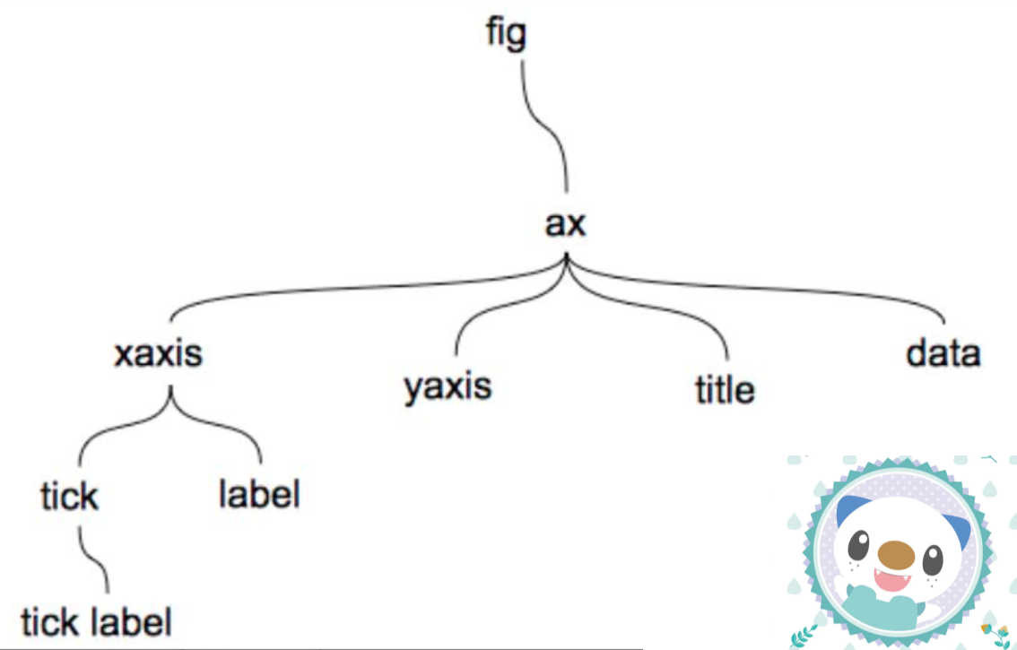
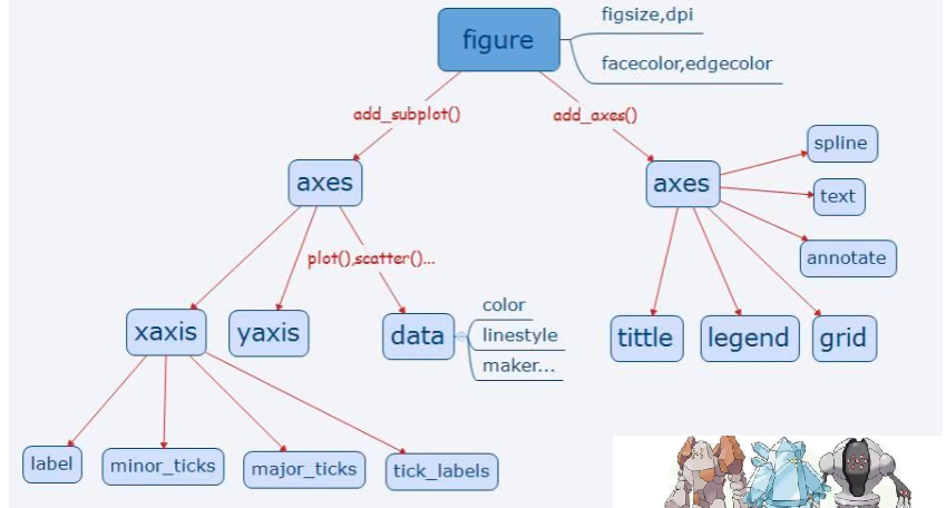
Matplotlib中对象层次
Matplotlib图像中最重要的三个对象分别是figure(画布),ax(坐标系),axis (坐标轴),它们有一个共同的基类:artist
一个figure容器中可以有多个 axes(多个子图)
一个axes中有多个axis(轴),title(标题),data(作图区的对象)
axis又有label,tick等对象,可以设置坐标轴刻度,坐标轴标签,坐标轴标题等
使用面向对象接口时,正确的作图流程应该是: 1.创建 Figure 实例
2.在 Figure 上创建 Axes
3.在 Axes 上添加基础类对象
或者简化为:
1.创建 Figure 对象和 Axes 对象;
2.为每个容器类元素添加基础类元素。
再浓缩成指导思想就是:
1.先找对象
2.再解决问题
打个比方,画图时你需要拿出一张素描纸,这就是创建画布,然后在这张纸上你想画碧海、蓝天、凉亭,你肯定事先会设计在哪个地方画这些内容,你决定的每个元素的放置位置就是在划分子图,而你决定好在哪画之后其实等价于在该子图位置创建了坐标系。后面就容易理解了,你的绘图等价于在子图的坐标系上绘图、添加图例、添加标题等。最后,对于坐标轴的样式(是否显示、刻度范围、刻度标签等),可以通过坐标系对象的方法,得到坐标轴对象,通过坐标轴对象的方法设置。
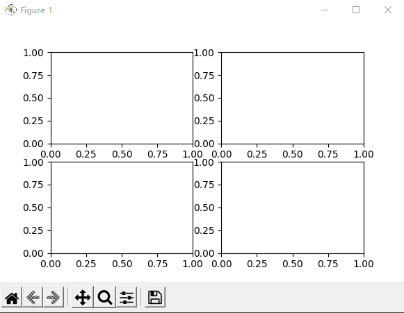
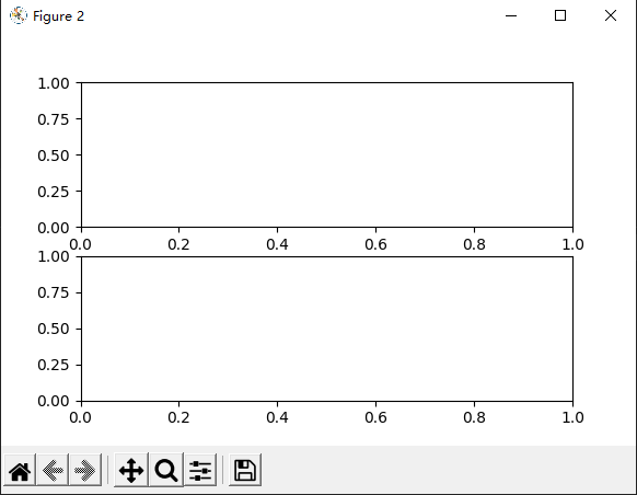
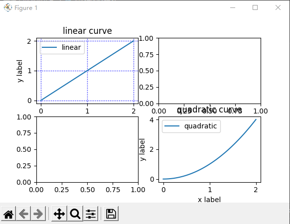
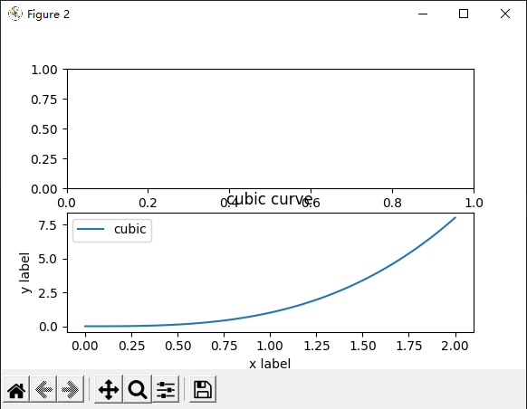
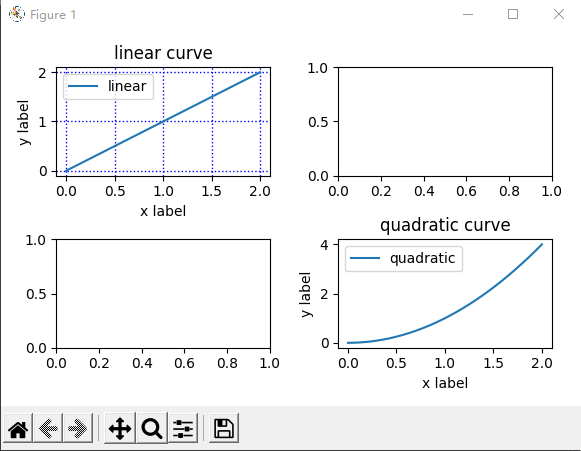
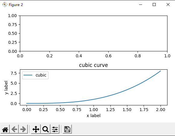
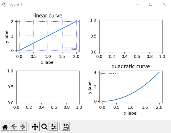
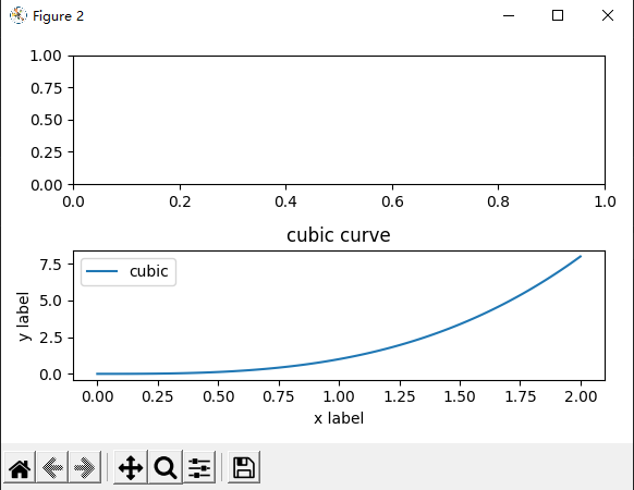
Chapter A:面向对象绘图(2张画布) Step1:建立画布 1 2 3 4 5 fig1=plt.figure(figsize=(5 ,3 )) fig2=plt.figure(figsize=(8 ,4 ))
Step2:建立子图 1 2 3 4 5 6 7 8 9 10 11 fig1.clear() fig2.clear() axes1=fig1.subplots(nrows=2 ,ncols=2 ) axes2=fig2.subplots(nrows=2 ,ncols=1 ) fig1.show() fig2.show()
Step3:选中子图,并在上面添加元素 1 2 3 4 5 6 7 8 9 10 11 12 13 14 15 16 17 18 19 20 21 22 23 24 25 26 27 28 29 30 31 32 33 34 ax1=axes1[0 ][0 ] ax2=axes1[1 ][1 ] ax3=axes2[1 ] x = np.linspace(0 , 2 , 100 ) ax1.plot(x, x, label='linear' ) ax2.plot(x, x**2 , label='quadratic' ) ax3.plot(x, x**3 , label='cubic' ) fig1.show() fig2.show() ax1.set_xlabel('x label' ) ax1.set_ylabel('y label' ) ax1.set_title("linear curve" ) ax1.legend() ax1.grid(color='b' , linestyle=':' , linewidth=1 ) ax2.set_xlabel('x label' ) ax2.set_ylabel('y label' ) ax2.set_title("quadratic curve" ) ax2.legend() ax3.set_xlabel('x label' ) ax3.set_ylabel('y label' ) ax3.set_title("cubic curve" ) ax3.legend() fig1.show() fig2.show()
Step4:对图像作最后微调 更多的作图细节,以及其他元素的设置细节,请参考官网文档 或其他网络教程
1 2 3 4 5 6 fig1.tight_layout() fig2.tight_layout() fig1.show() fig2.show()
1 2 3 4 5 6 7 ax1.legend(loc='lower right' ,fontsize='5' ) ax2.legend(loc='upper left' ,fontsize='5' ) ax3.legend(loc='best' ,fontsize='10' ) fig1.show() fig2.show()
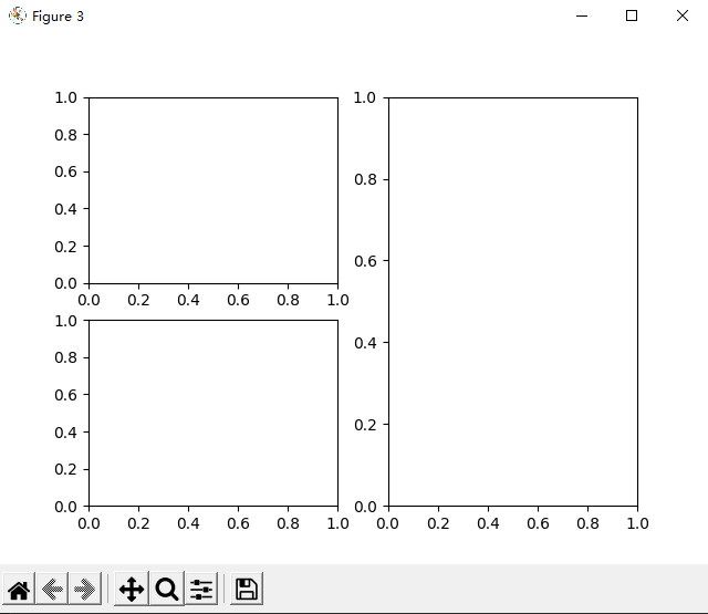
Chapter B:面向对象绘图(1张画布) 1 2 3 4 5 6 7 8 9 fig3=plt.figure() ax4=fig3.add_subplot(221 ) ax5=fig3.add_subplot(223 ) ax6=fig3.add_subplot(122 )
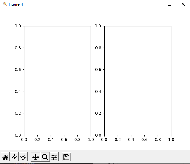
1 2 3 fig4,axes3=plt.subplots(1 ,2 ) fig4.show()
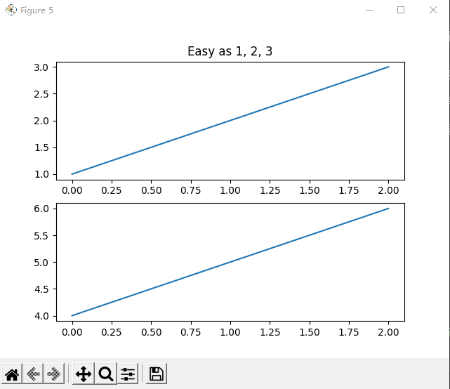
Chapter C:面向过程绘图(2张画布) 利用pyplot接口提供的函数,直接隐式创建对象,并在当前对象上进行操作
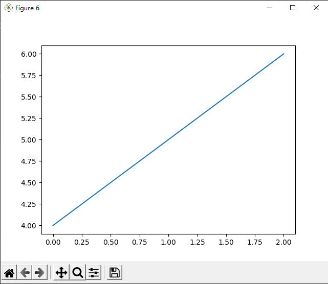
1 2 3 4 5 6 7 8 9 10 11 import matplotlib.pyplot as pltplt.figure(5 ) plt.subplot(211 ) plt.plot([1 , 2 , 3 ]) plt.subplot(212 ) plt.plot([4 , 5 , 6 ]) plt.figure(6 ) plt.plot([4 , 5 , 6 ]) plt.figure(5 ) plt.subplot(211 ) plt.title('Easy as 1, 2, 3' )
Text(0.5, 1.0, 'Easy as 1, 2, 3')
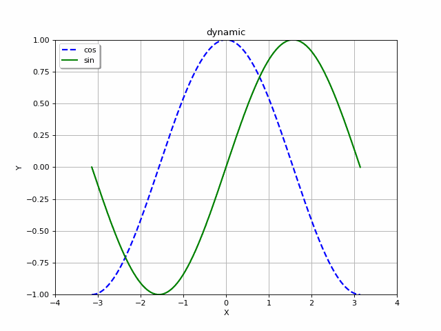
Chapter D:交互式绘制动态图 1 2 3 4 5 6 7 8 9 10 11 12 13 14 15 16 17 18 19 20 21 22 23 24 25 26 27 28 29 30 31 32 33 34 35 36 37 38 39 40 41 42 43 44 45 46 47 48 49 50 51 52 53 54 55 56 57 58 59 60 def simple_plot (): fig=plt.figure(figsize=(8 , 6 ), dpi=80 ) frames=[] for index in range (30 ): path_png='./frame/frame{}.png' .format (index) plt.cla() plt.title("dynamic" ) plt.grid(True ) x = np.linspace(-np.pi + 0.1 *index, np.pi+0.1 *index, 256 , endpoint=True ) y_cos, y_sin = np.cos(x), np.sin(x) plt.xlabel("X" ) plt.xlim(-4 + 0.1 *index, 4 + 0.1 *index) plt.xticks(np.linspace(-4 + 0.1 *index, 4 +0.1 *index, 9 , endpoint=True )) plt.ylabel("Y" ) plt.ylim(-1.0 , 1.0 ) plt.yticks(np.linspace(-1 , 1 , 9 , endpoint=True )) plt.plot(x, y_cos, "b--" , linewidth=2.0 , label="cos" ) plt.plot(x, y_sin, "g-" , linewidth=2.0 , label="sin" ) plt.legend(loc="upper left" , shadow=True ) plt.show() frame=plt.gcf() frame.savefig(path_png) frame = Image.open (path_png) frames.append(frame) plt.pause(0.2 ) frames[0 ].save('./plot/plot15.gif' ,save_all=True ,append_images=frames[1 :],loop=0 ,disposal=2 ) print ('done!' ) simple_plot()
c:\Users\Amadeus\AppData\Local\Programs\Python\Python39\lib\site-packages\PIL\Image.py:945: UserWarning: Palette images with Transparency expressed in bytes should be converted to RGBA images
  warnings.warn(


done!
存储所有画布 1 2 3 4 5 6 7 8 saves_path='./saves/' fig1.savefig(saves_path+'plot_fig1.png' ) fig2.savefig(saves_path+'plot_fig2.png' ) fig3.savefig(saves_path+'plot_fig3.png' ) fig4.savefig(saves_path+'plot_fig4.png' ) plt.figure(5 ).savefig(saves_path+'plot_fig5.png' ) plt.figure(6 ).savefig(saves_path+'plot_fig6.png' ) plt.figure(7 ).savefig(saves_path+'plot_fig7.png' )
Chapter E:具体绘制各种图,可视化教程 参考教程1 https://www.bookstack.cn/read/MatplotlibUserGuide/3.1.md
参考教程2 https://github.com/rougier/scientific-visualization-book